
If you are a not-for-profit radio station (such as a Christian radio station, Community Radio station, Educational radio station or LPFM), then it’s essential that you have a solid donation page. There are many issues to consider, but most of the barriers I’ve seen on donation pages are usability based, not technical.
In this article, I’m going to cover the key design and usability issues facing radio station donation pages.
This article is a part of my series on Building a Radio Station Website. Please check out the other articles for more information on creating a website for your radio station.
Much of the items covered in this article are based on donation page usability research done by Jakob Nielson, as well as lessons learned from some individual donation pages. Although Jakob’s article was written a few years back, many of the issues he identifies are still a problem on a huge number of donation pages.
Common Barriers to Making a Donation
Reducing barriers-to-donate is the name of the game. Let’s identify some of the common barriers faced by users when trying to donate:
- No transparency of donations (where does the money go?)
- No trust marks
- Username and password requirement
- Unnecessary fields
- Confusing fields
- Requiring a donation to be added to a ‘cart’
- SSL issues
- Sending donors off-site (to a third-party payment processor domain)
- Non-mobile optimisation
Donation Transparency
Donors want to see how their money will be used. This means you should:
- Show how much money goes to ‘mission’ and how much goes to ‘business’ or ‘fundraising’
- Provide copies of annual reports
- Show trust-marks and endorsements
Well Designed Donation Pages
There is a lot to be learned from others. Let’s take a look at some of the better donation pages out there:
Obama’s Organising for Action:

Charity:Water:

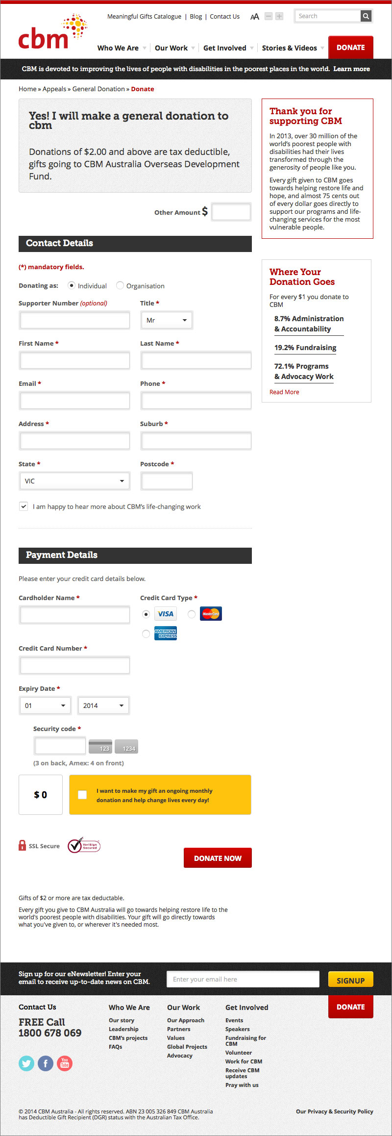
Christian Blind Mission:
Hope 103.2:

Donation Page Design Patterns
Studying these examples, we see a few common design patterns appear:
- Simple, clear form fields
- Only request the minimum amount of fields
- Big text
- Big buttons
- On-page field validation
- Very clear process (next buttons, columns, etc.)
This is contrasted to some of the bad practices on other donation pages:
- Unclear fields
- Requesting too many fields
- Small text
- Small buttons
- Validation that does’s work to takes you off-page
- Convoluted process (e.g. adding a donation to a ‘cart’ before processing it)
Technical Considerations
When building a donation page, there’s a few technical items to take into account:
- Use a secure payment gateway
- Don’t email the credit card details
- Keep users on the same domain (sending them off-site reduces conversions dramatically)
- Use SSL Extended Validation
- Ensure all resources are served via SSL
- Validate primarily with JavaScript, but with a server-side fallback
- Display friendly, self-explanitory inline field validation
- Don’t require your user to login to make a donation
- Integrate your page with your CRM to avoid a manual data-entry process
- Show easy ways to get help (phone, online tips, etc.)
- Clear “next steps” on your Thank You page (e.g. when will my receipt arrive? What happens if there is an error?)
- Send a confirmation email to the donor upon the transaction processing, thanking them and again saying when their receipt will arrive
In Conclusion…
There are many elements that go into a good, usable donation page. If you want yours to be a success, study the good and bad elements from other websites and apply them to your page. If you would like help with designing and developing a donation page, consider hiring me for your project.